News and inspiration for entrepreneurs and creatives, plus updates on new developments at Hatchwise.
Home / Blog Posts / Featured Design Contest: So-Well -A Company That Connects Massage Practitioners To Clients
Hatchwise is #1 in Creative Custom Logo Design and Eyecatching Marketing Material Design.

Featured Design Contest: So-Well -A Company That Connects Massage Practitioners To Clients
At Hatchwise, clients are always encouraged to interact and provide feedback as much as possible during their contest period. Contest holders have the option of rating and leaving comments on every entry. Of course, this isn’t exactly mandatory, but it does tend to give more satisfactory results. After all, no one likes to design in a vacuum, and people are more likely to submit designs when they’re actively getting feedback and a clear sense of direction.
Today we’re looking at a logo design contest that was run on Hatchwise for a new company called So-Well, and it’s a great example of what happens when contest holders are actively engaged with the project. The client, jammes.t, provided feedback in the form of star ratings, and received 798 entries for a $350 cash prize.
So-Well is a new company whose purpose is to connect massage practitioners with their clients. The design brief requested that the logo include the brand name plus a tagline. An icon representing wellness or massage could be included, and the color scheme requested was a palette of soft, calming colors such as beige, cream, or blue. Jammes.t specifically requested that no auto-generated images be included, and that all work be completely original.
So, let’s look at just a few of the designs that were submitted.
#1

#3000289 by Ilham Fajri
Plants and leaves remind us of the natural world, which makes them a common theme in wellness brands such as this one. These next few designs show the versatility of this theme. Here, we have loopy, natural script incorporated with a single leaf. Even so, the name of the brand is easy for us to read.
#2

#3000732 by marshallid
This whole logo has a handpainted feel. The script looks like it was drawn freehand, and the circle in the background could have been painted with a calligraphy brush. The sprig of greenery is centered over the text without detracting from the handmade motif.
#3

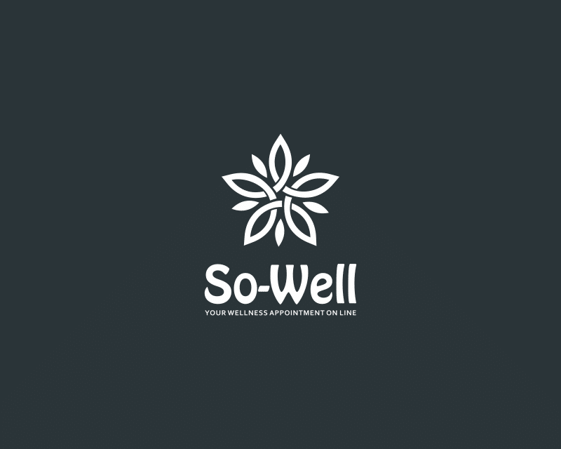
While it still borrows the plant theme, this logo is much more structured. The flower looks more like a mandala or celtic knot, which certainly would be appropriate for a wellness brand. The font is more orderly and symmetrical than in the previous examples.
#4

These next two plant-themed designs utilize the best of both frameworks. Even though the font is geometric and linear, the image of the stem and leaves use curved lines and have an offset composition. The icon is included within the text rather than centered above or beside it.
#5

Again, the flower here is more like a mandala than a flower, but it sits on a lily pad and looks like a rising sun with the circle surrounding it. The gradient in the color scheme and the brushstroke font style in some of the letters give this mostly orderly logo a playful, natural feel.
#6

These next few logos explore the butterfly motif as part of this wellness brand. This one has a more complicated image, with the flightpath showing above the flowy letters of the brand name.
#7

This butterfly is much more subdued. In fact, it looks like it’s landed right on the letter S, and is slowly moving its wings. That suggestion of stillness might be an ideal way to communicate peace and wellness for this massage company.
#8

The butterfly image is part of the text here. It’s so stylized it almost looks like a drawn heart shape flying right over the company slogan.
#9

There were several concepts submitted that included images and figures of yogis holding various poses. This one in particular stands out because the image could be so many things. It appears to be a figure holding a cross-legged lotus pose with arms upraised, but it could be a flower, or a candle with a lit flame, or a water lily. Regardless of what it’s meant to be, it evokes images of wellness perfectly.
And the winner is…

After receiving 798 contest entries, jammes.t chose this design. It’s 100% original and ever-so-simple. This beautiful design is unique without being showy or complicated. It scales well up or down, and will look good anywhere. The designer, MsttsM, received the contest prize of $350.
We hope you enjoyed these designs. If you want to see the rest of the entries, visit the whole contest page here.
Check out other Logo Design contests:
Moontouch Massage – Looking for a logo that combines these elements — perhaps a lotus flower in the shape of hands holding the moon? Open to all ideas though.
Emily Marie Massage Therapy – A private massage therapist working in a small town. In a session, they assure to individualize the experience based on the needs of each client utilizing a combination of deep Swedish massage, sports massage, and shiatsu to release aching, tired, or sore muscles from previous injuries, everyday stresses, or tensions.
Relaxing Now Massage – Looking to upgrade the look and feel of their current logo. The logo design is for Relaxing Now Massage.
Onsite Chair Massage Company – A logo for a chair that would first be used in businesses, and workplaces of all types; white/blue collar. Then special events: trade shows, health fairs, conventions, community events, parties – anywhere that chair massage would add to the event or help bring people in.
Bodylogic Therapuetic Massage – The town is famous for backcountry skiing and other outdoor rec; They are nestled in the mountains. BODY LOGIC means the human body.
- Katie
- February 5, 2023

