News and inspiration for entrepreneurs and creatives, plus updates on new developments at Hatchwise.
Home / Blog Posts / Featured Design Contest: Indiana Soap Supply – Soap Making Company
Hatchwise is #1 in Creative Custom Logo Design and Eyecatching Marketing Material Design.

Featured Design Contest: Indiana Soap Supply – Soap Making Company
No matter the size of your business, and no matter where your business is located, the one thing you don’t want to neglect is your business’s logo. Whatever logo you choose as the face of your brand is what customers will immediately associate your business with. Your logo will be on your signage, on your website, on your social media, on advertisements, on merchandise, and anywhere else you choose.
In those few split seconds that a potential customer looks at your logo, it’s important to draw them in. You want a logo that is eye-catching, informational, unique, and memorable. We know that may seem like a lot to ask for, but we promise it’s possible to create a logo that is all of that and more.
Many brands choose to turn to design firms to outsource their creative needs – and we can’t say we blame them. But there’s another avenue businesses can go down and that’s the logo contest route with a company like Hatchwise. Rather than shelling out money to a firm that often has one design vision, these companies are more affordable, allow you to see designs from countless designers, and are often faster at producing a logo than a creative agency.
Hatchwise allows you to detail exactly what you are looking for in a design and then their team of creatives will get to work. Logo entries will start pouring in and once the contest concludes, you simply choose a winner and can begin using that winning design.
Indiana Soap Supply is a recent client of Hatchwise and a client who found a winning logo in no time. Keep reading below to learn more about Indiana Soap Supply’s experience with Hatchwise.
What Was Requested
Indiana Soap Supply’s name does a good job of describing what they are all about – soap. Specifically, though, Indiana Soap Supply is a business that was started to make and sell wholesale soap that could be distributed to retailers across the United States. This piece of information was key for the client to share in their creative brief because it signified that this was not a mom-and-pop brand, it was a wholesale, national operation.
Besides a company overview, the client provided some additional direction in the creative brief. The client noted that they preferred a sans-serif-based font and that they did not want a script font. The client also wanted muted colors, but no pastels. The reasoning for this was that while the company makes pretty soaps, at the core, the business is still a manufacturing one.
The final piece of information the client shared was where the logo would be used. Indiana Soap Supply wanted to use this new design across different online channels and print mediums, so the logo needed to be versatile and scalable.
With that, Hatchwise’s team of creatives was ready to get to work. Below we take a closer look at the top entries Indiana Soap Supply received.
A Few Entry Comparisons

This first highlighted entry is bright and inviting. While the bubbles form a whimsical design, the overall design still feels corporate enough to be the logo of a manufacturing company. The designer followed the design brief by including muted, non-pastel colors and by choosing a sans-serif font. The bubbles depict soap bubbles and the components together create an eye-catching and unique design.

A second design entry by Bikram141 provides a different take on the client’s logo. This design included fewer colors and while the lettering is still a sans-serif font, the wording is stacked. Instead of multiple soap bubbles, the designer only included one bubble. The designer also included green as a color and included a green leaf on the soap bubble. This was an intentional choice by the designer since green is often the color associated with sustainability.

This logo design was one of the few entries that paid homage to the state of Indiana. To do this, the designer included an outline of the state of Indiana with soap bubbles serving as an overlay to the outline. The font is still a sans-serif typography, but with only capital letters in the brand name. Blue is a natural color choice, as that is a color often associated with water. The color choices and the font choice help the logo make a bold, powerful statement about the brand.

This entry combines different elements from other entries to provide a new take on the logo design. The designer chose a few different colors for the design – orange, green, gray, and blue. The blue coloring serves as the focal point and is written in a sans-serif typography. Beneath “Indiana” sit the other two words in the brand name, written in a smaller, all-capital-letter font. This logo feels fitting for a wholesale manufacturing business but ultimately it was not the winning design.

For this entry, the designer played around with a variety of colors to give the logo a welcoming, friendly tone. The brand’s name is written in a strong blue, in a bold sans-serif font, with the words “Soap Supply” being enclosed. By enclosing those words, the designer is emphasizing the focus on the product the client produces, soap. Coming out of the second “I” in the word “Indiana” is a series of five soap bubbles in a variety of colors.

Unlike other entries, this logo feels more corporate which served as a nice point of comparison for the client. This designer chose a font with sharp lines, which was different from other designers. This designer played around with space, particularly with the lettering. The designer chose two colors that work well together, blue and orange, rather than including a variety of colors that could potentially be distracting to the design. A final component of this logo is a line of “bubbles” that form an arch at the top of the logo. Unlike other designs, these “bubbles” resemble dots, giving the logo a more corporate and professional feel.

While other logos played around with rounded edges and arches, this logo design kept all components of the logo horizontal. The designer used their font choice as the focal point of the logo. “Indiana” is written in a lowercase font, whereas the “S’s” in “Soap Supply” was written in capital letters. Additionally “Indiana” is larger than the other two words and “Soap Supply” is placed beneath “Indiana” and is the same length as that one word. The designer played around with the coloring as well, which was unique to this design. The designer split up the coloring in “Indiana” which draws your eye to that word.

This logo design entry was a fun take on the creative brief. The rounded edges give the logo a softer, childish feel and the ombre effect of the coloring provides the viewer with many colors to take in, without getting overwhelmed. The font is different than other entries and instead of including soap bubbles, this designer played around with a different image. Instead, the designer swapped out an “o” with a bar of soap, helping to depict the focus of the brand.

This entry went more down the professional, corporate design path, rather than the playful one. The designer stuck to one color, in two different shades. The outline that frames “Indiana” also frames “Soap Supply.” This designer didn’t neglect any whimsical elements or bubbles and just focused on the brand name, which was a nice point of comparison for the client.

This designer provided two versions of their design for the client to review. One is written in orange, and the other is written in green. Both logo designs feel corporate but are unique. Coming off of the “I” are two soap bubbles, and the font is a strong, sans-serif typography. This logo is simple, yet clean and could easily be printed on a variety of channels and mediums.
The Winning Design

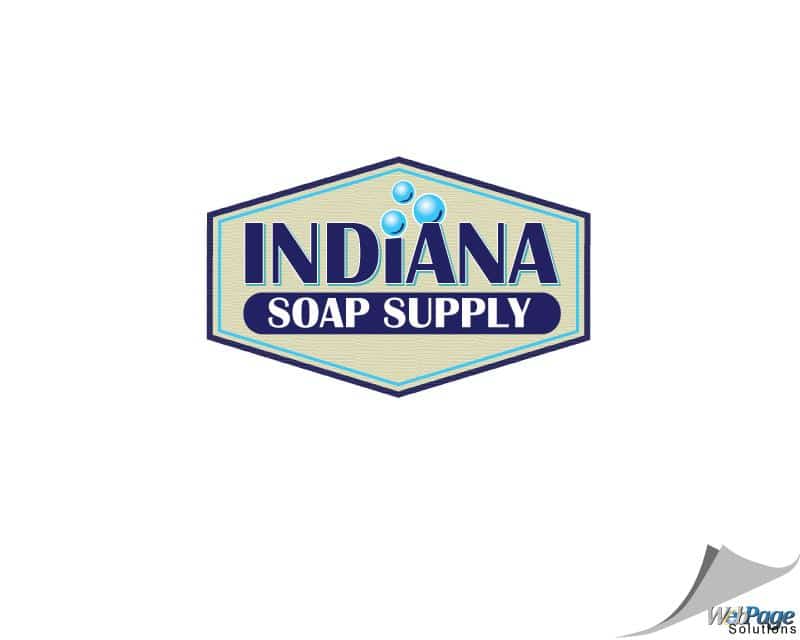
Indiana Soap Supply received 112 entries to choose their winning design from. Along the way, the client provided feedback to designers until they found a winning design, which was this entry by webpagesol. This designer was awarded $50 for this unique design concept. The client liked how this logo sat in a unique emblem shape which resembled a badge that is easily scalable and versatile. The logo includes three soap bubbles and is written in a strong, bold font. This logo draws your eye in and isn’t distracting with too many colors. This logo was exactly what the client was looking for and this design is the new logo design of Indiana Soap Supply.
Check out other Logo Design contests:
Cutting Edge – Cutting Edge is a digital marketing company for dentists and surgeons.
They offer all-in-one marketing packages which include a website, ongoing SEO, digital marketing, software, and strategy for one monthly price.
Snakehead Brewing Company – Upscale fun brewery on 70 acres in Baltimore suburbs. Targeting 21-55 years old’s (men, women, and families) with great food, drink, and live entertainment.
Little Brick Coffee – A company opening a small, drive up, coffee shop near a college town, on a main road, in a small Maryland town, near a civil war battlefield
Capps Orthodontics – A high-end, high-quality, boutique-style orthodontic office for all ages.
Alaska Prime Painting – A full-service painting and drywall contractor.., also an Alaska native. Tlingit, to be specific. Traditional colors black white and red are important to incorporate into the design.
- Katie
- January 16, 2023

