


As a design junkie, I have a special place in my heart for beer labels. More often than not, the label alone is the main factor in my decision to buy the product. When the store shelves are lined with dozens of unfamiliar options, I’m going to pick the one with the cool label and hope it tastes as good as it looks. Seriously, I’m a sucker for a great beer logo.
That’s why I’m excited to showcase this logo design contest for Hatchwise client Lucky2be. They needed a new logo for their up-and-coming brewery, Dop Brewing Company.
What the Client Requested
Lucky2be didn’t have a specific color scheme or image in mind. Instead, they wanted something “fresh and dope” that communicates a sense of community, beer making, and altogether just being excellent to each other. In their words, “I’d like the logo to stay close to my lifestyle. I brew in flip flops and T-shirts, and the walls are covered in graffiti-type paintings.” Hops and a lizard were two suggestions of elements that could be included.
The prize offered was $150, and the contest received 83 entries. So let’s check out just a few of them.

A simple graffiti-style font is bookended by two stylized crabs.

One thing the client mentioned in the project brief is this quote from Aldous Huxley, “If the doors of perception were cleansed, everything would appear to man as it is, infinite.” This designer seems to have had this in mind when creating this concept. The Dap letters suggest infinity, and the circles look like an endless spiral. The image of hops somehow looks more like a lion than a plant, which gives everything a trippy look.

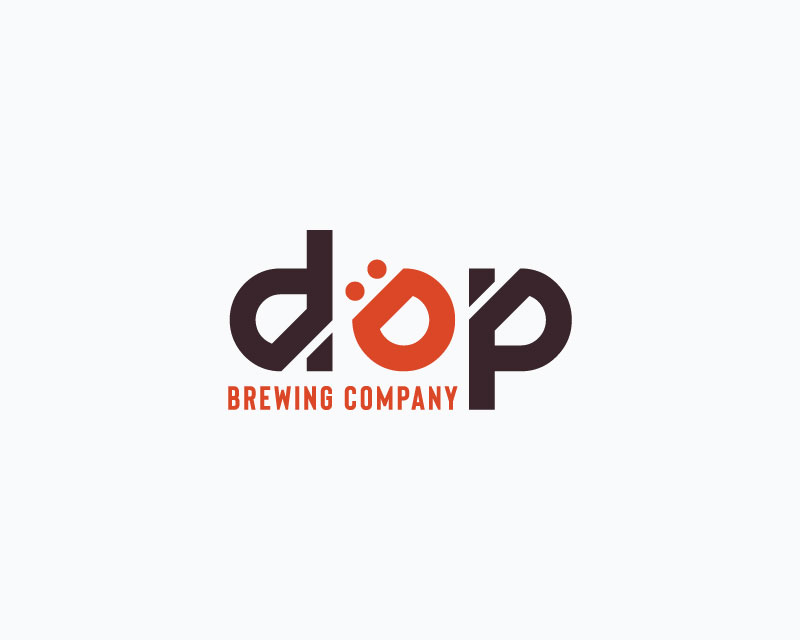
It doesn’t look like much at first. But look at the negative space. Do you see it? The white space spells out the letters d.o.p. A clever design that makes you look twice.

This design is simple but active. The rubber stamp font has a vintage 90s feel. The hops in the letters make the whole thing look fresh and vibrant.
Even though it’s a minimalist design, there is a lot going on here to make this logo stand out. The black and orange are bold but subdued, and the umlauted letter ‘O’ looks like a smiling face.
Acid wash and hypercolor? Yes, please! This design used the client’s suggestion of a lizard. Keeping the ‘dop’ off-center and putting the lizard at the end tricks the brain into seeing the word “dope”. Altogether a fantastic design for a cold beer or a vintage-style muscle shirt.

A drawing of hops compliments a graffiti font against a green paint splatter backdrop.

This one takes a different approach than some of the other entries. A simple black-and-white motif and a sensible font are on display here. The two brimming beers emerging from the hops plant suggest that this is a great beer to share with friends.

Another super rad color scheme is showcased in this design. Even though it’s a simple text logo, somehow we think of sun and surf when we look at it. The umlaut over the ‘O’ is a nice touch.
And the winner is…

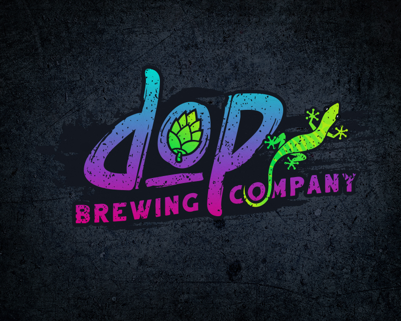
The winning design is colorful and fun. The lizards show both neon and earth tones, and the graffiti lettering is practically popping off the page with intensity.
This was a fun contest, and the client received lots of designs that would look great on a bottle or brewery sign. In the end the contest winner received a prize of $150. If you want to check out all 83 designs, you can visit the contest here.
Check out other Logo Design contests:
Maine-Ly Lobster – At Maine-ly Lobster they specialize in delivering fresh live lobster directly from Maine to the southern States. Their storefront location will be in Myrtle Beach South Carolina where they will sell live lobster to the public as well as delivery to local restaurants in the grand strand area.
Rebel Mountain Ranch Boer Goats – Rebel Mountain Boer Goats is a Boer goat breeding/show animals. Agriculture based.
Thompson’s River Bend Farm – Hemp farmers and have branded products under another name. This logo was for their farm for their sign, business cards, shirts, hats, etc. General use where the farm name is needed.
Manolo’s Cafe/Manolo’s Cuban cafe & Eatery – Small-scale Cuban coffee shop new to the area of Estero, FL with a history of shops in Miami since 1972. It is a 600 sqft area inside a gas station.
Will provide all types of Cuban coffee, pastries, and sandwiches along with contemporary coffee beverages. The target audience is the neighboring outlet mall, neighboring college,a residential community. and before and after work traffic flow of people.
Hardwork NYC, LLC. – Hardwork NYC, LLC. is a community-based staffing agency. Their goal is to seek hardworking individuals with the desire to work in fields across a number of sections and industries but may not have had to opportunity to show their talent. They are a firm that will seek, train, and place individuals who are looking to show off their skills and talent.