
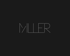
Miller
by Miller1Contest received 207 entries and the contest holder has awarded a winner.
- BACK TO CONTEST ENTRIES
- CREATIVE BRIEF
- ALL ENTRIES
Company or website name
Miller
Slogan or Tagline
A modern jewelry studio
Describe your company and organization and target audience
Miller is a modern jewelry studio. About style, not trends. These are cool designs in modern silhouettes that start a conversation. They call attention to themselves quietly because there is something unique about how they look, fit, are constructed. We play with shapes, elevate the ordinary, and help you see beauty from a different perspective. Our jewelry becomes part of a woman’s greater wardrobe, worn year after year, making the corresponding outfit something more, and giving the wearer confidence because she has something unique, complex, and deep (not superficial). We don’t just care about giving you something pretty, we care more about how our pieces make you feel, and help you live your life better.
Our target: For women aged 18-90. About attitude, not age.
For women (and men) with many dimensions: Hard and soft, male and female, precious and rough, gentle and a bit provocative.
She’s got a little bit of outlaw to her. She gambles on herself.
But she’s human, not a robot. She can laugh at herself, she makes mistakes and learns from them.
The design should have the following
We want the name Miller to be the logo - meaning: no need for another icon. Miller should be a strong identifier.
This is a strong brand with intellect and a brain behind it. Modern, linear, streamlined, restrained. I like the idea of using negative space; rather take something OUT than put more in (see pictures attached)
This is not girlie, fragile or frilly: No serifs, curly cues, cursives.
This is NOT artisanal, or hipster.
This is not about fleeting trends – whatever design trend is happening now, we’re not a part of it. Our pieces and our design are built to be timeless but we are not fine, luxury jewelers like Cartier, Bulgari, etc. We are humans behind the production.
Tone/Feeling:
Minimal. Don’t need a lot of extra’s to make the point.
Smart, confident, free - but not intimidating. Feel the power in yourself so you can tackle what you need to in the day: work, taking care of kids, etc.
Accessible, open. There must be a wink, some humor, a bit of levity/lightness, wit. Not too serious.
This logo will be used for
- Online (Website, facebook etc.)
- Print (business cards, letterheads, brochures etc.)
This design should not have this in the entries
Colors we dislike: yellow, orange, red, pink, pastels. Too young.
What style of logo would you like?
Colors to use in the design
Colors we like:
Deep, sophisticated colors that don’t call attention to themselves. They are almost neutral: Navy blue, teal, dark grey. Work well with gold and other metails.
Briefly describe your contest
Miller is a a hand-crafted jewelry line for women, designed for versatility. No rules in how to wear. Scope of project: Create an identity out of name